What’s changing and what’s new across Insigneo’s brand evolution
by Giovanna Souza, Head of Marketing
Miami, FL – May 15
Insigneo is launching a new brand identity — five years after its last visual refresh in 2021. More than a logo update, the renewed brand represents a broader transformation: a refreshed visual system, a refined narrative and a redesigned digital experience.
Together, these elements create a more accurate expression of what Insigneo has become over the years and where the firm is headed.
Why the Brand Evolved
The move was deliberate and grounded in something deeper than aesthetics.
Over the past years, Insigneo has expanded significantly across markets, strengthened its platform and infrastructure, and deepened its role in supporting Investment Professionals and their clients internationally.
As the business evolved, it became increasingly clear that the brand needed to evolve with it. The evolution is not a shift in direction. It’s a clarification of it.
The Idea Behind the Brand
“Your Passport to Possibilities.”
At the center of the new brand identity is the concept of the passport, inspired by a broader reflection of what Insigneo does for its audiences.
For international HNW clients — particularly across Latin America — Insigneo provides access to global markets and investment opportunities that extend beyond their domestic markets.
For Investment Professionals, Insigneo offers access to a broader ecosystem: infrastructure, platform, resources and support that empowers them to run their own practice and focus on guiding their client’s legacy.
Across both, Insigneo connects worlds: geographically, financially, and culturally.
The concept of the passport captures that role in simple terms, translated in the main umbrella tagline for the brand.
What Changed in the Visual Identity
The evolution of the brand is reflected in a more structured and intentional visual system.
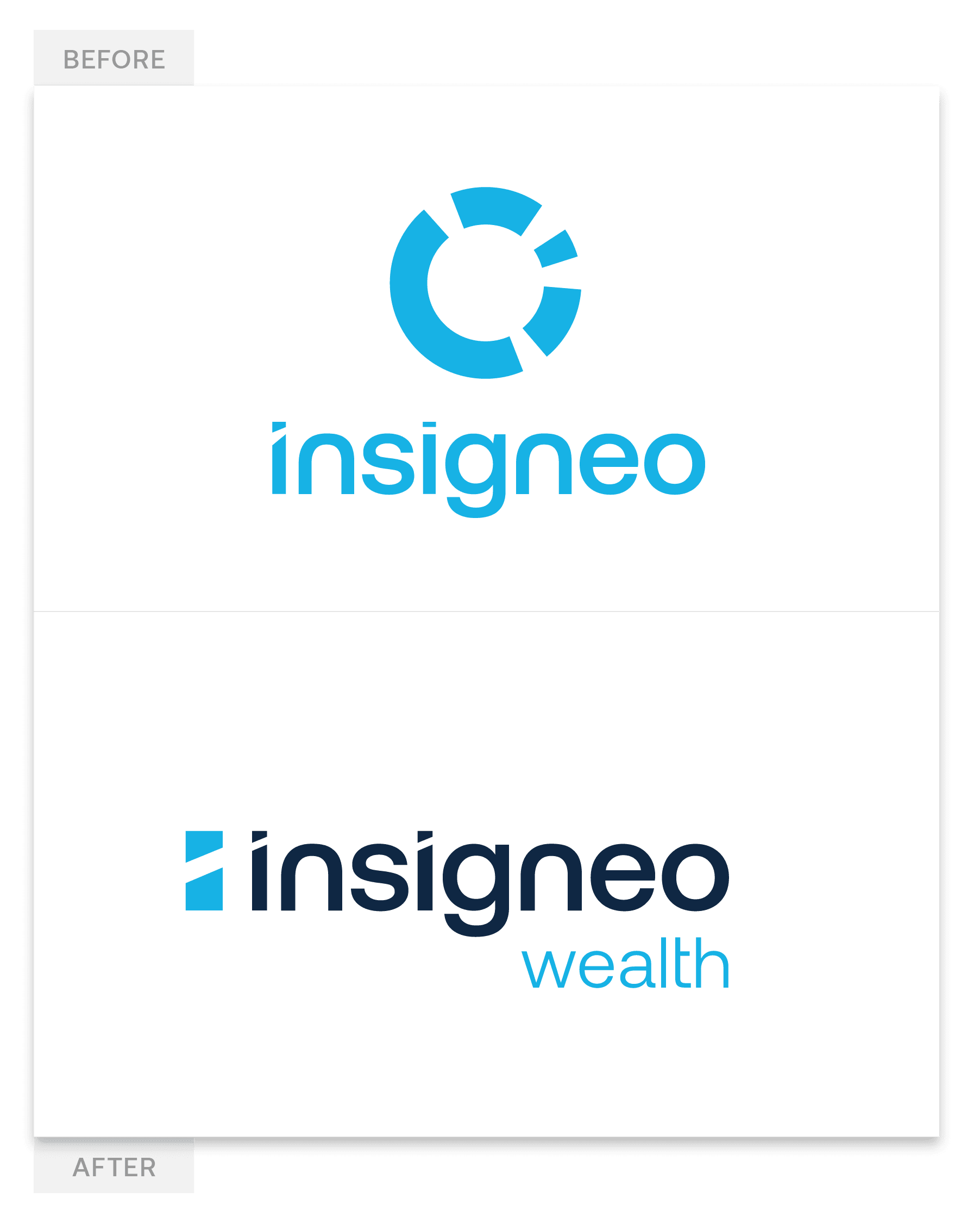
A refreshed logo
The logomark “insigneo” has been preserved, maintaining continuity with the brand’s origins and history.
The most visible changes include:
- The introduction of “wealth” as a descriptor, reinforcing industry positioning
- A shift from bright blue to navy, aligned with the broader color system shift
- Subtle refinements to letterforms, improving balance, legibility, and overall structure
A new symbol
The previous “pie chart” isotype has been replaced by a new, simplified symbol derived from the letter “i”, which reinterprets an abstract passport form and becomes the defining element throughout the new visual system.
The element serves multiple purposes:
- It reflects the “passport” concept at the core of the brand identity
- It enables the brand to scale effectively across digital environments
- It provides a recognizable visual asset for smaller formats, such as applications and social platforms
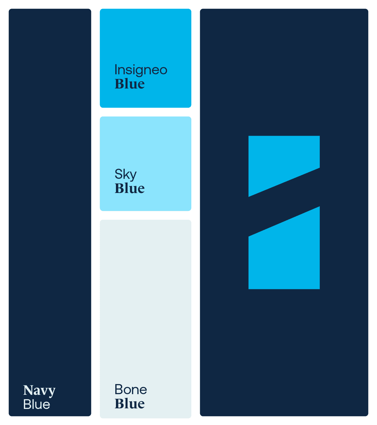
A more refined color system
The palette shifts toward navy blue as the primary color, reinforcing stability, trust, and alignment with the wealth management industry.
The brighter blue—long associated with the brand—remains, but with a more controlled presence. It is now used as an accent, preserving brand equity while supporting a more balanced and sophisticated composition.
Balancing Tradition with Modernity
Throughout the new visual system, the brand identity reflects the balance at the core of Insigneo’s positioning.
Wealth management is, by nature, a traditional industry. However, Insigneo has always differentiated itself through a more modern, collaborative, and flexible approach. At the same time, it needed to distance itself from purely digital platforms or fintech companies.
The updated identity was designed to reflect this unique space Insigneo occupies within the industry, balancing modernity with tradition. Every decision across the entire system has been intentional, from the combination of editorial-style serif typography with geometric sans-serif fonts, to the contrast between deeper navy tones and the brighter blue historically associated with the brand.
One brand, multiple perspectives: audience-specific taglines
Insigneo operates across a B2B2C model, supporting Investment Professionals, who in turn, serve UHNW/HNW end-clients. It also maintains relationships with other industry players such as asset management firms, custodians, and platform solution partners.
As part of the relaunch, the firm introduced audience-specific messaging that complement its main tagline. These are designed to create greater clarity and resonance for each stakeholder group:
- Clients: Guiding your financial future. Wherever life takes you.
- Investment Professionals: Empowering your future. However you envision it.
- Institutional Partners: Connecting capital to opportunity. Wherever the industry takes us.
Different perspectives. One consistent foundation.
A Brand Built from Listening
The evolution of the brand was also shaped by feedback from Insigneo’s network.
As the firm continued to grow, Investment Professionals increasingly needed a clearer way to explain what Insigneo is, how it operates, and the value it brings to clients.
The new brand identity emerged as a response to those needs.
A Full-Scale Rollout
With offices across more than 12 locations, a relaunch at this scale extends well beyond a design decision. It’s the beginning of a new journey.
The renewed brand will be rolled out gradually across all touchpoints, including digital platforms, marketing materials, institutional communications, and client-facing assets.
Looking Ahead
With this evolution, Insigneo strengthens its position as an international wealth management firm built around connection, access, and partnership across the Americas and beyond.
The foundation remains unchanged.
The expression is now clearer.
Media contact
Name: Giovanna Souza
E-mail: marketing@insigneo.com
Cellphone: +1 (645) 214-8793